How to make a Cartesian chart in Word
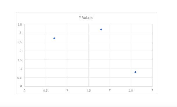
To achieve a Cartesian graph, in Microsoft Word you must use the option Scatter plot (XY). In a nutshell, it is a graph that displays, within a Cartesian space, the way in which the two variables (X and Y) interact with each other, plotting data points on the horizontal and vertical axis. To make it inside your Word document, you will also need it Microsoft Excel, through which you can enter the data relating to the variables (a fundamental step also in all the other types of graphs that I will show you). However, you can find everything explained in detail in the next few lines.
PC
make an XY chart on WordFirst, open the application on yours PC Windows or your Mac and choose whether to create a new document or to modify an existing one.
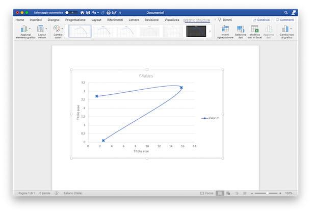
Once you have opened the file of your interest, click on the point in the document where you want to place the chart, select the tab Inserisci (top) and press the button Graphic. In the new window that opened, select the option Dispersion (XY) from the present list and choose whether to use the template a points, the lines (Curves with indicators, Curves, Lines with indicators, Correct) or bubbles (with the possibility of 3D bubbles).
Once you have found the chart that best suits your needs, click on the button OK, to insert it and start making it. At this point, the selected chart will appear in the document. In addition to this, a files in Excel connected to it, in which to report the values of variables X and Y.
Therefore, in the Excel document, modify the default values with the numbers you wish to use and, in the Word document, the X and Y variables will also be automatically modified, showing the relative position of the points (or lines / bubbles, in based on the chosen chart).
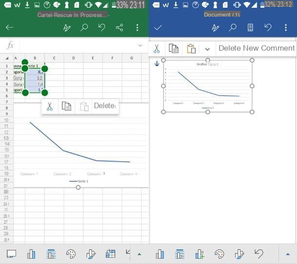
Once you have finished editing the data, close the Excel file (you can reopen and edit it at any time by clicking on the Change datathe Edit data in Excel a Mac) and customize your chart by choosing from the different options made available by the desktop version of Word, under the heading Graphic structure (a menu that you can open by clicking on the tab of the same name).
Now you can, by clicking on the icon Add graphic element, to insert further axes, assign him gods titles and data labels, or, for example, give a title to the graph, adding error bars or a legend.
By clicking on the icon Quick layout, instead, you can choose a layout already set among those available: in this way, without having to add anything manually, you can quickly decide which elements of the chart to show.
To change the graphic styleinstead, you can click on the icon Change colors and choose the color set which you prefer among the options Monochrome e Polychromatic. Finally, you can change it Style clicking on the previews of the available ones or passing the mouse cursor over them to view the final result (without, however, setting it).
Instead, clicking on the icon Swap rows and columns, you can invert the data of the axes, moving the data present on the X axis into the Y axis and vice versa. Again, by pressing on the icon Select datainstead, you can change theinterval. Finally, if your need is to change the chart type, reporting the same data in a different type (for example in a pie chart), you can click on the icon Change chart type and select another type of chart from those available.
Pressing on the tab SizeInstead, you can make further changes by selecting a specific graphic element to format and adding some Form, (being able to modify also the styles), of the Stili WordArt or Alternative text to identify the various objects. Also, through the features Location e Wrap text, you can change the location of the chart, while you can change the size of the chart selecting the desired centimeters of height and width.
To further modify your work, on PC, you can also use the keyboard shortcuts placed next to the graph, to its right. By pressing the button Layout options, you can change its location while clicking on the buttons Graphic Elements, you can insert additional elements, on Graphic styles you can change the style and colors and, finally, on Graphic filters, you can change the visible data and names.
Smartphones and tablets
Use theapp in Word for mobile devices available for Android e iOS / iPadOS (which I told you about in detail in this guide)? So, as I mentioned earlier, it is not possible to insert graphics directly into the document.
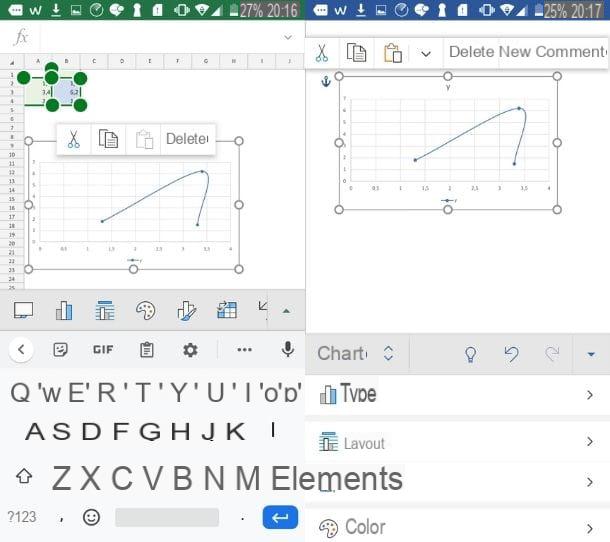
You can, however, make a chart in the Excel for Android or iOS / iPadOS (perhaps following the instructions I gave you in my guide on how to create a Cartesian chart in Excel) and copy it into your Word document.
Once done, then tap on chart in the Excel sheet and select the icon Copy (the one represented by two overlapping sheets) from the menu that opened, then open a new tab of your device, start the app Word and open the document where you want to insert it.
Once this is done, click on the icon pencil, in order to make the changes, and subsequently, in the point of the sheet where you want the graph to be pasted, tap on the icon Paste (the folder with a sheet next to it).
At this point, the graph will appear in the document and you can edit it using the keyboard shortcuts or by pressing on menu Home and selecting the tab Graphic among those extras (or, again, by tapping on the graph and waiting for the Graph menu opens by itself). Alternatively, if you use a tablet, click directly on the tab Graphic (in alto to destra).
Now, in any case, you can make the changes related to the layout, to Elements, Color and at the Style, by clicking on the relative icons and choosing from the various available settings. You can also change its collocation (using functions Wrap text e Arrange) On dimensions and add a alternative text (always pressing on the relative options in the menu), in the same way as I described above. Easy, right?
How to make a pie chart in Word
The chart that best fits your project is a cake, also called areogramma, which represents the data in the form of "wedges"? If your answer is yes and, therefore, you are wondering how to make a chart in Word using this pattern, follow the instructions below.
PC
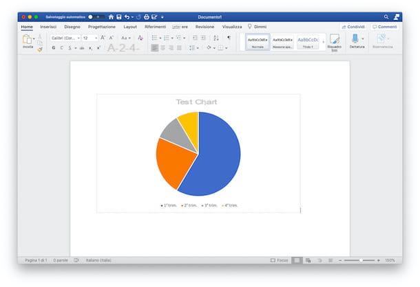
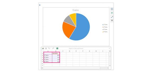
If your need is to insert a pie chart inside your Word document, all you have to do is open the document in question, select the point where to insert the chart (by clicking on it), and press on the tab Inserisci. After that, click on the option Graphic and, from the list that has opened, press on the item Cake.
At this point, choose the pie chart mode you prefer among Cake, 3D cake, Cake pie o Cake bars (recommended if you have more than 7 categories of data to insert in the chart) e Ring. Once selected, click the button OK, to insert it into the document.
You can then go to work on the dataset within the document Microsoft Excel opened, needed to create the chart. To do this, in the first row of the columns of the Excel sheet (Column A e Column B), enter the data labels, then in the Column A indicates the categories of data of which you are in possession, while in the Column B enter the percentages related to this data.
In this way, by modifying the data in the Excel sheet, you can view them represented in the pie chart, which will automatically divide according to the percentages you have indicated in the various rows of column B. Once done, close the Excel sheet by clicking on the 'icon X or on red dot (if you are using a Mac).
At this point, you can proceed with adding graphic elements to make the pie chart even more complete with information and with the change the layout and style, to customize it, using the same keys and the same features that I indicated earlier.
Smartphones and tablets
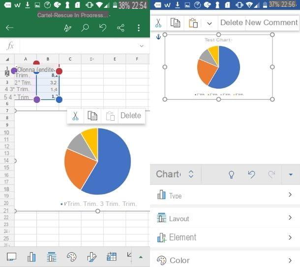
If the only means you have available are the Excel and Word mobile app, to insert a pie chart into your document you must first create it in Excel. To do this, I advise you to carefully read my guide on how to make a pie chart in Excel, in order to make it fast and in the best possible way.
Once created, tap on it and, from the opened menu, press the icon Copy (the one represented by two overlapping sheets). Then, open a new tab, tap on theapp in Word present on your device and choose whether to open a document from those already present or whether to paste the chart into a new document.
Now, within the chosen document, press the icon of pencil (to be able to make changes), select the point where to insert the graph, tap on it and first on the button Paste (the folder with a sheet next to it). This way, the chart will be pasted into the sheet.
At this point, you just have to modify it to make it even more functional and rich in details, in order to improve its reading and understanding. To perform these actions, you can follow the instructions I gave you previously.
How to make a line chart in Word
Your need is to make a line chart in Word, to represent the flow of your data on a time scale, its trend and trends? Then, even in this case, there is no problem. You can easily do it by following the instructions in the next paragraphs.
PC
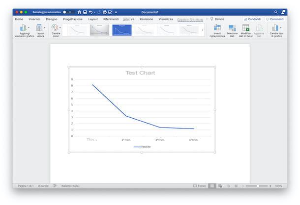
For served of the line graph and use it in your Word document, first select the place in the document where you want to insert it, then click on it. Then press on the tab Inserisciclick on your button Graphic and select, from the new window that has opened, the option Tiers.
At this point, you have to choose the type of line graph that best represents your data among those in the list: you can choose from the graphs in 2D (Lines, Stacked Lines, 100% Stacked Lines, Lines with Markers, Stacked Lines with Markers, and 100% Stacked Lines with Markers) or between charts with Linee in 3D, 2D area (Area, Stacked Area, 100% Stacked Area) e 3D area (3D Area, 3D Stacked Area, and 3D Stacked Area 100%). After selecting the type of chart of your choice, click on the button OK, to insert it into your document.
Once this is done, the graph will appear in the selected point and a new Excel document will open connected to it, in which to modify the dataset contain sample defaults.
Now, then, on the opened Excel page, enter the first row of Columns A and B (and later, if necessary) le Labels of your data. After that, under the Column A, reports the Categories to use. Under the Column Binstead, it reports i give you own. Automatically, as the data in Excel changes, the graph contained in the Word document will also change.
To add more lines, you can use the Column C and subsequent ones, by entering further data and using the same measurement scale decided previously (remembering, moreover, to insert the label relating to the type of data in the first line). When you have finished entering the data, close the Excel sheet by clicking on the button with the X on Windows or on red dot, its MacOS.
Once this is done, all you have to do is improve the representation of the graph using the appropriate menu Graphic Structure or using i keyboard shortcuts (available in the version for PC Windows): therefore modifies the graphic elements inserting more, the layout and style, as I showed you in the chapter dedicated to the creation of the Cartesian graph and that's it. Easy right?
Smartphones and tablets
If you use a smartphone or tablet, you can follow the same procedures that I indicated in the previous chapters, going to create the graph inside theExcel app and gluing it, subsequently, in Word document where you need it to be present.
To do so, open theExcel app and follow the tips I gave you in this guide, relating to the creation of a line chart in Excel. Once created, tap ongraphic image and press the icon Copy, to copy it to the clipboard.
Now, you can open theapp in Word present in yours Home screen, by tapping on it, and choose the document and the point in which to insert the graph (by pressing, first, the icon of pencil to be able to modify it). Once done, tap on the selected point and, from the opened menu, press the icon Paste, to paste the graph image.
Now, following the advice I gave you earlier, you can modify your line chart by choosing to act on layout, the style, the elements, colore and all other editable and improvable elements.
How to make a tree chart in Word
Il tree chart, on the other hand, it is a particular type of graph that allows you to view the data in a hierarchical manner, using colored rectangles. In essence, it is a useful graph in the case of representations of large amounts of data and specific proportions within the hierarchy to be represented. To make it happen, you can follow the procedures described in the next lines.
PC
make a tree chart and insert it into a Word document, select the point where you want to view it, by clicking on it; then press the tab Inserisci, scegli l'opzione Graphic and, from the opened window, select the item from the list Tree then press the button to finish OK. A Macinstead, follow the path Insert> Chart> Hierarchical> Tree.
Once done, the graph will be shown in the document and the connected Excel file will also open, to be used to edit the dataset to be displayed in the graph.
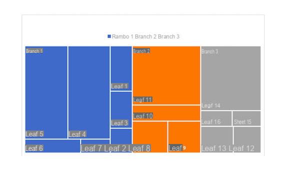
To do this, you can change the default setting by inserting the main categories within the Column A (i.e. the branches) and the subcategories in the Columns B and C (stems and leaves, proceeding hierarchically); finally, you can edit the Column D, inserting the data you have (or adding more in the following columns as well, if necessary).
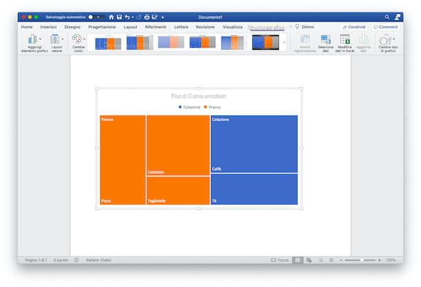
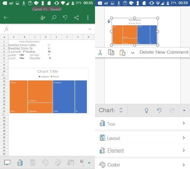
To explain better, here is the Excel file used for the realization of the example chart "Food consumption".
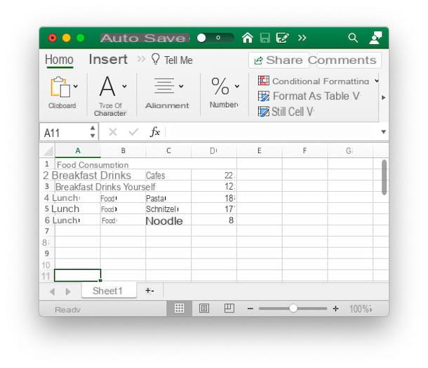
As you can see, in the Column A, starting from the second line, there are the main categories, that is i branches (Branch 1: Breakfast, Branch 2: Lunch). In the Column B, on the other hand, there are stems, that is the first sub-category useful for the purposes of graphic representation (Stem 1: Drinks, Stem 2: Food). In the Column Cinstead, the leaves, that is, thelast subcategory to be evaluated (Leaf 1: Coffee, Leaf 2: Tea, Leaf 3: Pasta, etc). Finally, in the Column D, the amount to be represented within the tree chart, relating to the various leaves.
Once you have edited the Excel file, you can close it by clicking on the icon X (or on the red dot, if you are using a Mac), and proceed by modifying the elements of the chart as I showed you earlier, using the tabs Graph structure e Size.
Smartphones and tablets
Do you want to make a tree chart using the Word and Excel apps on your mobile devices? So first, you need to boot Excel and open a new document.
After that you have to recreate a table similar to the one I showed you in the previous chapter, inserting in the Column A the branches of the graph (i.e. the main categories), in the Column B the stems and in the Column C leaves. Finally, in the Column D, the data to be displayed in the graph, relating to the leaves.
Once done, select the table you just made, tap on the icon triangle (oi three horizontal dots a iPhone), tap on menu Home and select the item from among those present Inserisci. After that, tap on the option Graphic and choose the voice from among those available Tree and select the chart preview. At this point the graph will appear on the Excel page.
To insert it into your Word document, now, tap on it and press the icon Copy. Once done, open a new tab, launch Word and select the document in which you want to insert the tree chart (using the icon of pencil to be able to modify it).
Subsequently, tap on the point in the document where to insert the graph and, from the opened menu, press the icon Paste, to paste the graph. At this point, by pressing on it, the menu will open Graphic, to modify it following the instructions I gave you previously. Easier than I thought, right?
How to make a chart in Word