You have been sent files in Excel that you have to elaborate and enrich with pie charts, and then show them in a meeting. You are very happy to have received this assignment but, unfortunately, having not used Excel often, you do not know very well how to proceed. You have therefore opened Google in search of a guide that could explain you how to make a pie chart in excel and you're done here, on this tutorial of mine.
This is exactly how things are, right? Then don't worry, because in today's guide you will find all the information you need to create a pie chart both in the classic Microsoft Excel desktop client and through its online platform and app for smartphones and tablets.
Are you curious to learn more about the topic? Perfect! In this case, let's not waste any more precious time and get to work right away. What you need to do is simply sit comfortably and carefully read all the advice you will find in the following chapters. I just have to wish you a good reading and, above all, a good job!
Index
- How to make a pie chart in Excel
- How to make a pie chart in Excel Online
- How to make a pie chart in Excel from smartphones and tablets
How to make a pie chart in Excel
If you want to make a pie chart for the data you have prepared in your Excel sheet, what you have to do is carefully follow all the procedures that I will show you in the next chapters.
Create a pie chart in Excel

Before taking action and finding out how to make a pie chart in excel, you must verify that the data you have available are suitable for this type of representation. For this reason, in the next few paragraphs, I will give you some guidelines to follow to make sure that your work is not useless.
First, you need to make sure that some essential rules are followed, so that you can draw a pie chart for your data. First, there must be only one set of data, that is, there must be only one match for these. In other words, each item of an element in a row must match only one data in the adjacent column.
If, for example, you have a set of data broken down by year (for example the type of products sold from year to year), you cannot report these in a pie chart, but the ideal would be a histogram. If, on the other hand, you want to create a chart for the categories of products sold in a specific year, the pie chart might be for you.
Also, a pie chart, since it has the representation of a unit as a percentage, zero or negative values cannot be displayed and, therefore, are not allowed. Null values will not simply be represented, while negative ones will be taken as absolute values.
Finally, consider not creating a pie chart in case you have more than seven categories of data, to prevent the chart from being unreadable. For this purpose, however, Microsoft Excel provides some types of pie charts called Cake pie o Cake bars, which allow you to view, with an additional graph, all those values that are too small that are not displayed well on the main one.

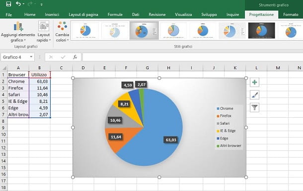
Having said that, in the example that I will give you in this guide of mine, I will prepare the data relating to the use of the various browsers for Internet browsing by users.
First, in a new Microsoft Excel document, indicate the labels for the columns A and B, on which to indicate the type of data you are going to enter: in my case, I will attribute the label Browser to the column A, while I will attribute utilization to the column B.
Having done this, in the column A you must indicate the categories of data for which you will then enter the values. These can be of any type, based on the set of data in your possession: in my case, I will indicate the most used web browsers, therefore Chrome, Safari, Internet Explorer, Edge, Firefox and, finally, Other browsers.
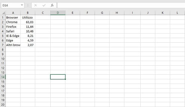
At this point, all you have to do is report the data corresponding to the categories indicated by you: these data must be entered in the column alongside (the one B), exactly in correspondence with the categories indicated in column A. My advice is to indicate them as a percentage, to avoid that some data may not be correctly represented.
Now that you have your dataset, it's time to create a pie chart. First, highlight the table by selecting the column values A e B. During this procedure, also include the column labels.
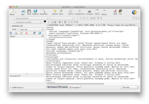
After doing this, go to the tab Inserisci, which you find at the top, and press the button Recommended charts. In the screen that is shown to you, then select the card All charts and click on the entry pie chart, which you find in the sidebar.
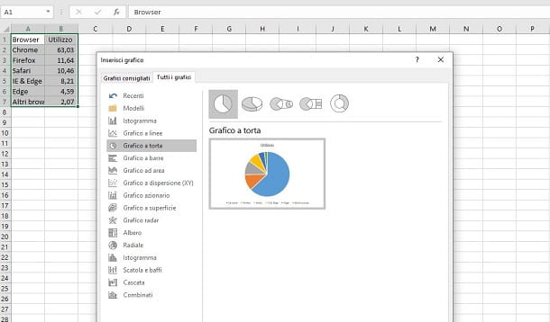
Good. At this point, you have to decide which type of chart to choose: the classic version (pie chart), the 3D one (3D cake) or one of the two graphs for the representation of numerous categories (Cake pie o Cake bars). Finally, you can also choose the ring view (Ring), which shows the data on the crown of the pie chart.
When you have decided on the type of pie chart to use, simply press the button OK, to confirm its insertion on the Excel worksheet, right next to the corresponding data set.
Customize a pie chart in Excel
The representation of a pie chart in Microsoft Excel it can be customized in every aspect. For example, by clicking on the graph, you will be shown icons on the right: one a shape of a funnel allows you to filter the data, in order to remove some of them from the representation, while thepaintbrush icon allows you to access a small panel for changing the style and colors of the chart
Having said that, although the tool in question allows you to customize the color and style of the pie chart, my advice is to act directly from the tabs Planning e Format, which you find in the bar at the top.
These sections, in fact, include many more tools to customize the chart, being able to change, for example, the colors of the text borders or the fill, change the colors of the chart or choose a different layout, which could show percentages or labels. on each slice or even hide them.
Finally, by pressing on+ icon on the chart, you can decide whether to show or hide certain elements of the chart, such as the title, data values or the legend.
How to make a pie chart in Excel Online
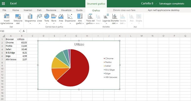
You don't have a PC with Microsoft Excel and therefore don't know how to create the pie chart for your dataset? In this case, you don't have to worry, because you can work on Excel Online: Microsoft's tool to create spreadsheets directly from the browser, without the need to install any software.
You need to know that you can take advantage of Excel Online completely free of charge, as long as you have a Microsoft account, which is necessary to log in to this Microsoft service.
Once this is done, go to the Excel Online website and log in with your Microsoft account credentials, following the on-screen login procedure. Now, you have several alternatives to start working: you can create a new document (New blank workbook), select one on OneDrive from the list below or import the spreadsheet file from your PC, using the button Load and open.
At this point, in the Excel document screen, adjust the data as I explained earlier. When you have your dataset, highlight it, including both values and column labels, and hit the tab Inserisci, located at the top.
Once this is done, click on the icon Cake and, among the options shown to you, choose whether to create a classic pie chart (2D cake) or the ring (Ring). Unfortunately, unlike the desktop version of Microsoft Excel, on Excel Online it is not possible to create other types of pie charts and, therefore, you will have to settle for the only two available.
Furthermore, while in the desktop version of the software there is the possibility to customize the graph in every aspect, as I explained to you in the dedicated chapter of the tutorial, in the Web version of Excel you cannot change anything. The only operations that are allowed to you concern the display of some elements on the chart, such as the legend, the labels or the title, acting from the tab Graphic, above, and making the necessary changes to these parameters in the section labels.
Now do you want to save a copy of your project for offline viewing on your PC? In this case, select the items File> Save As> Download a Copy, to download a copy of the file in XLSX. If, on the other hand, you just want to share it with other users, click on the items File> Share> Share with other users.
How to make a pie chart in Excel from smartphones and tablets
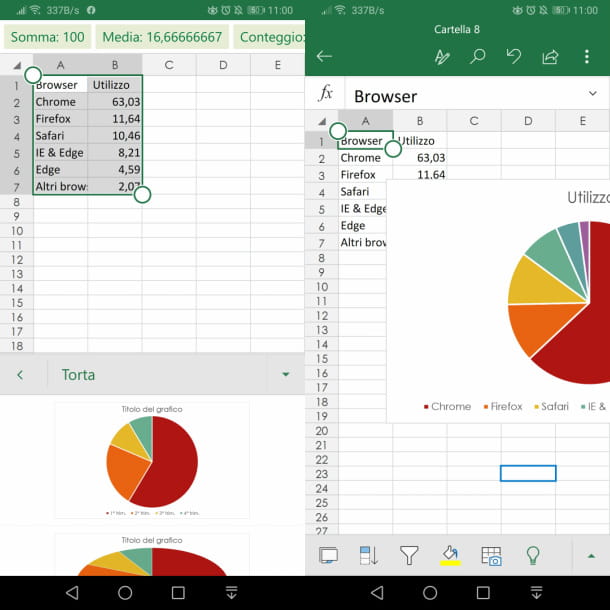
If you have no way to use either the desktop version of Excel or the online one, then you might want to think about working on your spreadsheet directly from theExcel app for Android and iOS.
The app is basic free, but if you are using a device with a display size larger than 10.1 inches, you need a subscription to use it. Office 365. The same goes for the functions that allow you to add or modify the elements of the chart, which are only available in the subscription version of Office, starting from 7 euro / month o 69 euro / year.
That said, after installing the Microsoft Excel and having started it, log in with your Microsoft account and, on the main screen, open a spreadsheet from the device memory, selecting the items Open> This Device. Alternatively, you can open one featured on OneDrive, by tapping on the items Open> OneDrive Personal. To create an empty sheet, instead, press onsheet icon, located at the top right, and select the option Blank workbook.
Once this is done, after you have arranged the data following the guidelines I gave you before, highlight them all (including the labels), by tapping on a cell and moving thecue ball icon. At this point, from a smartphone, press the icon ▲ (Android) or ⋮ (iOS) and select the item Inserisci from the drop-down menu that is proposed to you. From a tablet, on the other hand, tap on the tab Inserisci that you find at the top.
From the options shown to you, choose first Graphic and then Cake. Then choose the type of chart you want to insert between pie chart, 3D cake, Cake Cake, Cake Bars o Ring And that's it.
If you followed my directions to the letter, a pie chart will be placed right next to the selected dataset. By tapping on the graph, you will access a series of tools that will allow you to customize the style and colors, with the possibility of activating or deactivating the display of some elements, such as the title, the legend or the values, in a way similar to what you I described earlier.