The time has come for job reports, the ones that need to be shown graphics and summaries of the results achieved: this time, the task of generating all the necessary material, including all the relevant charts and diagrams, fell to you, and your boss has specifically requested that these be created through the program Excel.
Although you have gladly accepted this task, you have realized that you have not the faintest idea of how to make a chart in excel and now you are desperate for a simple solution that can get you out of trouble, because you just don't want to know about failing your commitment. Did I guess? Perfect, this is just the right place to start: in the following paragraphs, in fact, I will show you in detail how to transform the data of an Excel worksheet into a graph, so as to obtain a well-done graphical summary and make a great look with your boss!
Don't worry, you don't need any special computer skills to achieve the desired goal - these are relatively simple operations that can be set up directly from within the program. Having said that, you just have to start your copy of Excel and carefully follow the instructions I am about to give you, which apply to all versions of the software, both for Windows and for macOS, and you will also find indications for Excel Online and the app for smartphones and tablets. What else to tell you? Happy reading and good work!
Index
- How to create a chart in Microsoft Excel
- How to make a chart in Excel Online
- How to make a chart in Excel from your phone and tablet
How to create a chart in Microsoft Excel

Make a chart in Excel it is not a very complex operation, however it is necessary to start from a series of well-organized data: in the following lines, I will explain to you both how to proceed starting from scratch, i.e. by typing the information to be inserted in the graph in progress, and how automatically generate a graph starting from existing data.
Finally, it will be my care to show you how to use the templates made available by the program to create real worksheets based on graphs. Having made the necessary premises, you just have to get to work: start without hesitation Excel (or the worksheet containing the data to be included in your chart) and strictly follow the instructions I am about to give you. You will see, the result will not disappoint you!
Create a new chart
To begin with, once you open Excel (and after selecting the option Blank workbook, if you do not have a sheet already sorted with the data you want to include in the chart), start organizing the worksheet in the way that best suits the information you have.
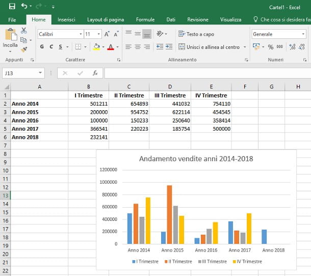
For example, to create a graph that represents the quarterly trend of sales, with the statistics year by year, you can use the column to insert the reference years (e.g. 2022, 2022, 2022 and so on) and the lines to specify quarters. Below, I show you an example of organization related to the worksheet under analysis.
- Cell A1 - by structure, cell A1 does not contain any information.
- Cell A2, A3, A4 (and the whole column A) - contains the reference years to be analyzed. You can use, for example, labels Anno 2022, Year 2022, Year 2022 etc.
- Rooms B1, C1, D1, E1 (The riga 1, starting from letter B) - you can specify the reference quarters there, using labels such as I Trimester, II Trimester, III Trimester, IV Trimester.
Does the chosen label not fit into the cell and its content is literally truncated? Don't worry, it is possible to adapt the cell size to its content: see my dedicated guide for more information on this.
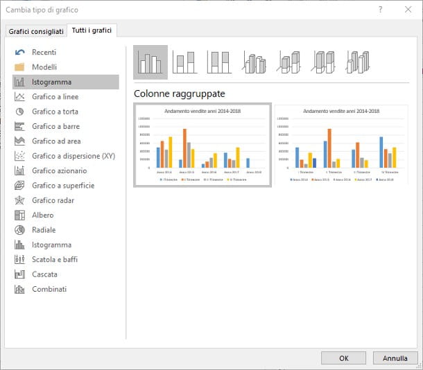
Once the data within the spreadsheet is sorted correctly, click on the first cell top left to include in the chart (you can include labels if you intend to use them as axis labels), press the key Shift and click onlast cell at the bottom right; alternatively, you can select the cells by clicking on the first useful cell and "dragging" the mouse until you reach the last one.
Once you have selected the data range of your interest, click on the item Inserisci at the top, press the button Recommended charts and then on the board all charts attached to the new panel that opens.
At this point, you just have to select the type of chart through the left part of the selection window, and then choose it style using the panel above. This way, you will be capable of make a line chart in Excel, the cake, Cartesian, etc.
When you are satisfied with the result, press the button OK to confirm your choice: after a few seconds, the graph is displayed in the worksheet. If you want to give it a title, double-click on the wording Title of the chart and type the caption you want to put on it.
If you want, you can protect the cells that contain the headings from accidental changes, so as not to change the labels of the chart without realizing it: I taught you to do this in my tutorial on how to protect Excel cells.
You just don't like the position of the chart within the spreadsheet? Don't worry, you can move it in a very simple way: grab the entire drawing with the mouse using the white spaces next to the window title (in this way, the selection includes the whole field of the graph, and not just a part of it) and drag it in the position most congenial to you.
Enter data into a chart
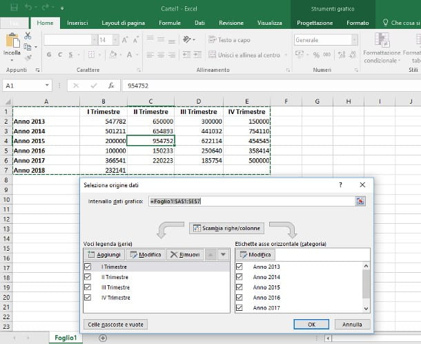
Now that you understand how to make a chart in Excel, I bet you are wondering how to do it add new data inside: going back to our example, the boss may ask you to insert a new row relating to the sales trend in 2013, even though you have already generated the graph using the organization seen previously.
Worried about having to recreate the entire table from scratch considering the new dataset? Don't worry, there is no need, as the "inclusion" procedure is much simpler: first, add the new lines or columns within your worksheet with the usual procedure (right click on a row or column and select the item Insert… from the context menu), and fill them with the necessary data. Once this is done, you just have to "tell" Excel to include the new information in the chart.
How? Very simple: do it click destroy on an empty point of the graph in question, choose the item Select data ... from the context menu, select with the mouse the data range to include in the drawing (exactly as you did in the creation phase), then click on the button OK attached to the overlay panel to add the new values to the graph. In this way, the drawing will be updated with the entered data!
I bet, at this point, you're wondering how insert dynamically generated values into the cells, for example to create a new table containing the total number of items sold during the whole year. Excel can help you in this too, since it is possible to make the program perform operations in a completely automatic way: to proceed, you can use the instructions that I have given you in my specific guides on the topics, listed below.
- How to sum in Excel
- How to subtract with Excel
- How to multiply in Excel
- How to square and how to power in Excel
- How to calculate the percentage in Excel
- How to subtract the percentage in Excel
- How to sum the hours in Excel
Make a chart starting from predefined templates
Have you received a spreadsheet full of data, but you don't have the option to create a chart from it, as they are too messy and would have to be organized manually? In this case, the advice I can give you is to move them inside one of the predefined templates of Excel dedicated to graphs.
Excel, in fact, is designed to create worksheets starting from ready-made templates, available both on the computer and on the Internet, capable of automatically generating the necessary graphs and customizing them at a later time, according to your needs.
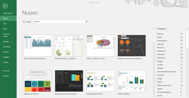
To make a chart starting from a predefined template, start Excel (or click on the menu Fillet and select the item New, if you've already opened the program), then type the word graphic in the search box located at the top, and press the button Submit of the keyboard.
Using the previews shown and the side navigation bar dedicated to categories, identify the model that best suits your needs and create a new one workbook based on it simply by doing Double-click on the chosen preview.
Have you already created a worksheet with one or more tables attached and intend to use it as a starting point for the future? You can "transform" it into a custom model, to be uploaded using the aforementioned procedure, following the instructions I gave you in my specific guide on the subject.
How to customize a chart in Excel
Now that you've finally managed to create a “basic” chart that can correctly show the data in the spreadsheet, it's time to figure out how to customize it.
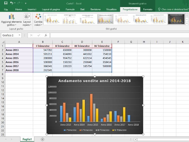
The operations that you can perform, in this sense, are really many: you can customize it graphic style already in the creation phase, as I explained above, or modify it at a later time: to proceed, click on an empty point in the graph and then on the tab Planning, located at the top of the Excel screen.
The program window is slightly modified, and shows most of the tools dedicated to the structure of the graph: you can quickly change the style of the graph using the previews shown in the box Graphic styles, change the arrangement of the elements via the button quick layout and change the color scheme using the button Change colors: Changes are applied instantly.
If you wish, you can quickly invert the rows with the columns of the chart (without affecting the data range of the worksheet) by clicking on the button Swap rows / columns; add new data, using the button Select data or completely change the type of chart (turning, for example, a histogram into a pie chart), using the button Change chart type.
Via the button Add graphic element you can modify and customize the elements on the chart. For example, if you want to know how to make Excel chart with percentage, click on this button and then select the items Data Labels> More Data Label Options. In the right sidebar that is shown to you, put a check mark in the box Percentage and disable that Value.
If you want to know instead how to make Excel chart with standard deviation, after creating any scatter chart, press the button Add graphic element and select the items Error Bars> Standard Deviation.
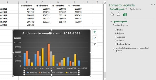
The customization options don't end there, though, as Excel makes the practice available right sidebar dedicated to defining the details for each element of the chart. For example, by clicking on items in the legend, the sidebar allows you to customize the position and format of the text; in the same way, by clicking on an element of the data series, it is possible to define its graphic options (shading, contours, 3D format, fill, path axes and much more).
Generally speaking, it is possible to customize in detail all the elements that make up the graph, simply by clicking on them and browsing through the settings proposed by the right panel.
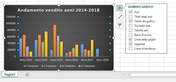
Last but not least, it is possible add or remove elements to the chart (titles of the axes, summary tables of the data, trend lines, errors and so on) by clicking on an empty point in the graph and then on the small button capacitor positive (+) lead which appears to his right.
How to delete a chart in Excel
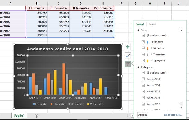
The last information I have to give you, to complete this tutorial on managing charts in Excel, concerns the deletion of data: in this regard, you can choose whether to delete only data series or categories you no longer need, or to completely clear the chart from the workspace.
To clear a series or category of data from the chart (e.g. a reference year that you no longer need), click a empty spot of it and then on the small button in the shape of funnel that appears on the right, then remove the check mark from the box that distinguishes the category / series that you intend to remove from the graph, attached to the new proposed panel and finally presses the button Apply per confermare I modified it.
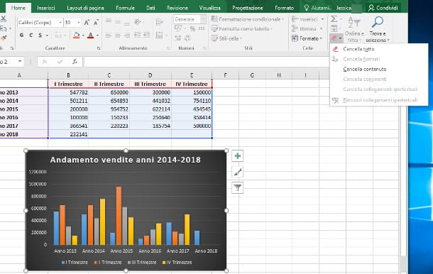
If, on the other hand, you intend to completely eliminate the entire graph, perhaps in order to create a completely new one, click on the graph itself, then on the section Home located at the top left, click on the small button in the shape of eraser annexed to the group Modification (usually on the far right of the panel) and select the icon Erase everything give the purpose menu.
How to make a chart in Excel Online
Su Excel Online, the well-known online and free platform of the famous Microsoft spreadsheet program, it is possible to create graphs in a very similar way to what has already been described in the previous chapter dedicated to the desktop counterpart.
Once you have highlighted all the cells to include in the chart, move to the tab Inserisci and choose one of the graphs in the section Graphs. The possibility of customization, however, is quite limited, as not all the tools described above are available for Microsoft Excel.
However, if you click on the chart, you will be shown the card in the section above Graphic. Reaching the latter you will find several useful tools: you can invert the axes, change the data source, change the type of chart with another, as well as being able to act on the titles and labels of the data represented.
If you then want to delete an incorrectly generated graph, all you have to do is click on it and then press the button Canc keyboard. Simple, right?
How to make a chart in Excel from your phone and tablet
If you use the Excel app for smartphones and tablets, available on Android (also on alternative stores) and iOS / iPadOS, you can create graphs using the specific function. I remind you that the Excel app can be used for free on all devices equipped with a screen with a size equal to or less than 10.1 "(otherwise a subscription to the service is required Microsoft 365).
What you need to do, after starting the app Excel and open the spreadsheet, is to select the range of cells that contains all the data to be inserted in the chart (you can help you with the appropriate selectors by pressing on a cell). Once this is done, move to the tab (from a tablet) or to the drop-down menu item at the bottom (from a smartphone) called Inserisci.
So choose the voice Recommended chart, if you want a suggestion on the possible charts that can be used based on the selected data, or click on Graphic, choosing one of those proposed. Doing so will automatically add a chart to the sheet. By pressing on it, the section will be shown Graphic at the top (on a tablet) or at the bottom (on a smartphone).
Within this section you can find several options to change the type of chart, the layout, the elements present (title and label), color and style, as well as the possibility of inverting the source data.