- histograms they are one of the simplest and most effective methods to represent the results of a market research or, more generally, of recurring data and are therefore linked to frequencies. They are commonly called bar charts and one of the simplest ways to get them is to create them in Excel.
How do you say? Do you use Excel but are you a beginner and have never heard of histograms? This is normal, but don't worry. With today's guide, we'll see how to make a histogram with excel in such an easy way that you won't have to read this article more than once to learn it perfectly. How about we start right away?
The indications I am about to give you refer to all the most recent versions of Excel for Windows and macOS, but there will be some mention of the older versions of the famous Microsoft software. Also, I'll walk you through how to work through Excel Online, the web version of Excel accessible at no cost from any browser for Internet browsing, and I'll tell you how to create histograms using the mobile version of Excel, which is available for Android, iOS and Windows 10 Mobile. In short: you just have to choose the device and the software platform from which to act and follow the instructions below. Happy reading and, above all, good work!
Index
Create a histogram with Excel on PC and Mac
If you want to learn how to make a histogram with excel and you are using a recent version of Office for Windows or macOS, the first step you need to take is to start Excel and open in it the spreadsheet containing the data from which you want to draw your graph.
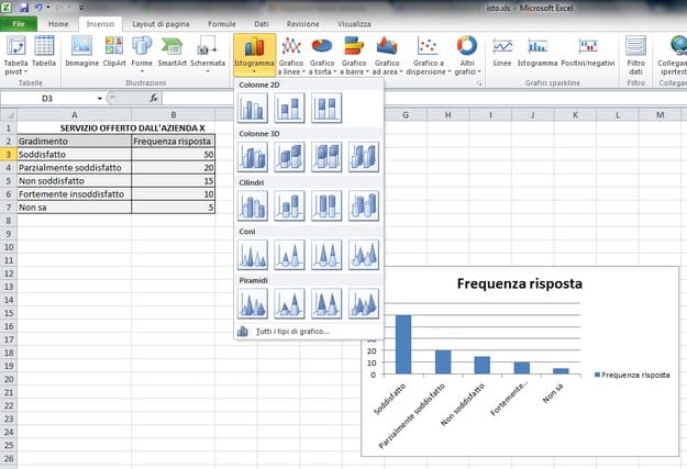
At this point, you must hold down the left mouse button and select all the cells containing the data you want to display in the graph (eg the answers given to a survey and the frequency with which they were given). The data must be arranged in two columns: on the one hand i give to be analyzed and on the other i data in bin, which represent the intervals by which to measure the frequency.
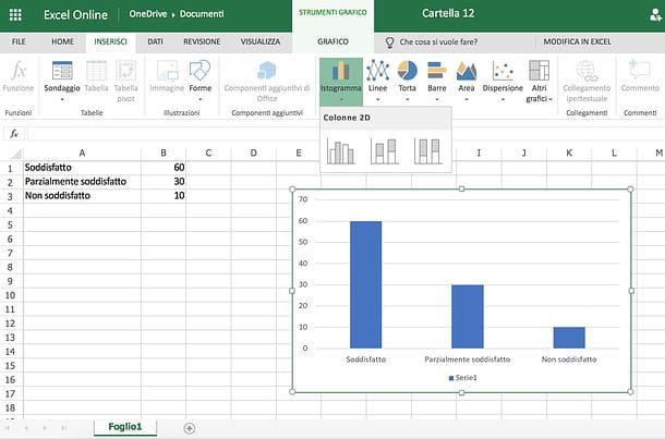
Then click on the button Histogram contained in the card Inserisciof Excel (the one with the three vertical bars) and select the type of chart you want to use through the box that appears. At this point, almost as if by magic, your chart will appear in the spreadsheet with the data selected in the cells. You can move the graph and resize it freely using the mouse, while to customize its appearance (e.g. change the colors of the bars) you have to click on it and use the tools on the tab Graphic tools that appears in the Excel toolbar.
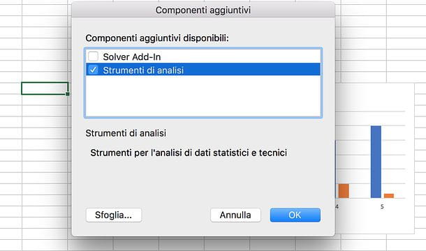
If you do not want to create a simple histogram but you want to analyze the data and frequencies contained in a spreadsheet using this type of graph, you have to click on the button Fillet located at the top left and select the item options from the menu that appears. In the window that opens, select the item Additional components from the left sidebar, click on the button vai(below), put the check mark next to the item Analysis tools - VBA and click on the button OK to activate the analysis of the data in the form of histograms.
If you use a Mac, to activate the analysis tools you have to go to the menu Tools> Excel Add-ins which is located at the top, you must put the check mark next to the item Analysis tools and you have to press the button OK.
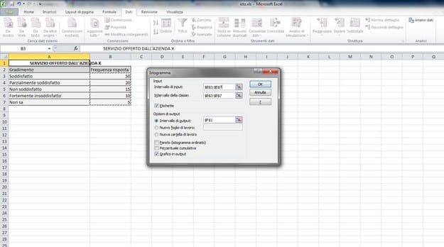
At this point, go to the tab Data in the Excel toolbar, click on the button Data analysis (bottom right) and select the item by double clicking on it Histogram from the list that appears. In the window that opens, select the data of theinput range and class interval by clicking on the button with the red arrow placed next to these items, put the check mark next to the item Grafico in output and click on OK to get your histogram.
Dated versions of Excel
If you want make a histogram with excel and use Office 2003 or earlier, you must select with the mouse all the cells containing the data to be inserted in the graph and click on the button chart wizard present in the toolbar of the program (it is the one with the colored icon of the bar graph). In the window that opens, select the item Histogram from the left sidebar, click on the type of chart you want to create and first click on NEXT three consecutive times and then on end but I will complete the operation.
To activate the data analysis tool in the form of histograms in Excel 2003, select the voice Additional components from the menu Instruments of the program, put the check mark next to the item Analysis tools - VBA and click on the button OK. To start the data analysis, however, you must select the item Data analysis from the menu Instruments in Excel.
Create a histogram with Excel Online
As already mentioned at the opening of the post, Excel is also available in a web version, called Excel Online, which can be used directly from the browser (eg. Chrome, Firefox o Safari) and does not require any type of payment. To access it, just have a Microsoft account (if you don't have one yet, you can fix it by reading my tutorial on how to create a Microsoft account) and log in with it. As easily understood, it does not include all the functions of Excel for Windows or macOS, but for the creation of simple histograms it is more than enough.
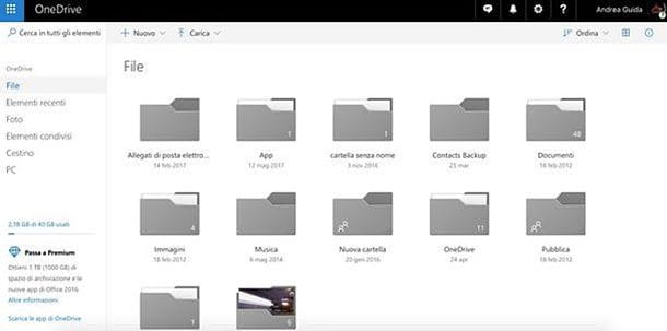
To create a histogram in Excel Online, connected to the main page of the service, log in with your Microsoft account (if necessary) and click on the button to create a blank workbook. If, on the other hand, you want to act on an already existing file, connected to OneDrive (the Microsoft cloud storage service, which I told you about in detail in my dedicated tutorial), click on the button Go to my OneDrive (if necessary), log in to yours Microsoft account and drag the Excel sheet you wish to act on into the browser window. At the end of the upload (which you can follow using the arrow which appears at the top right), click on the icon of the file you have just uploaded to open it in Excel Online.
Now all you have to do is follow the same procedure that I showed you before for the classic version of Excel (the one for Windows and macOS). Then select the cells that contain the data you want to display in your chart (the data must be arranged in two columns: i give to be analyzed and i data in bin, which represent the intervals by which to measure the frequency), click the button Histogram contained in the card Inserisciof Excel Online (the one with the three vertical bars) and select the type of chart you want to use from those available.
Finally, go to the tab Graphic tools to customize the appearance of the newly inserted chart in Excel Online and use the mouse to move or resize it. When you are satisfied with the result, you can choose whether to save the file online on OneDrive or download it locally to your PC.
Pigia, quindi, sul pulsating Fillet located at the top left, select the item Save with name from the bar that appears on the side and click on the button Save with name to save the file to OneDrive or the button Download a copy to download it offline to your computer (as an XLSX file).
Create a histogram with Excel on smartphones and tablets
Do you often need to edit spreadsheets on the go? No problem: Excel is also available in the form of an app for smartphones and tablets, is compatible with Android, iOS and Windows 10 Mobile and can be used at no cost on all devices equipped with a screen with a size equal to or less than 10.1 "(otherwise it requires a subscription to Office 365, with prices starting from 7 euros / month).
To create a histogram in the Excel mobile application, download the latter from the store of your device (if necessary, since on many Android and Windows 10 Mobile devices it is installed "as standard"), start it and log in to your Microsoft account (if you don't have one yet, follow the directions in my tutorial on how to create a Microsoft account).
At this point, you choose if create a blank workbook or whether to open an existing file, by going to the tab apri application and selecting one of the many available options: you can open a file from your device memory or from supported cloud storage services, such as dropbox, OneDrive e Google Drive.
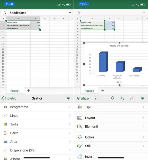
Once you have created or opened the document to act on, you just have to click on first cell which contains the data to be included in the graph, press on indicators that appear on the sides and complete the selection by highlighting all the other cells of your interest. At this point, if you use one smartphone, presses the icon of pencil located at the top right, select the item Inserisci from the drop-down menu that appears at the bottom left and then go up Charts> Histogram to choose the type of chart to insert in the spreadsheet. If you use a tablet, however, go to the tab Inserisci Excel, presses the button Graphs and select the item Histogram give the menu to compare.
Finally, position and resize the chart with your fingers and, if you want, change its appearance using the commands on the tab Graphic of Excel. Then save the document by pressing on back arrow (if it is a new file, you will need to specify the name to be assigned to it).